
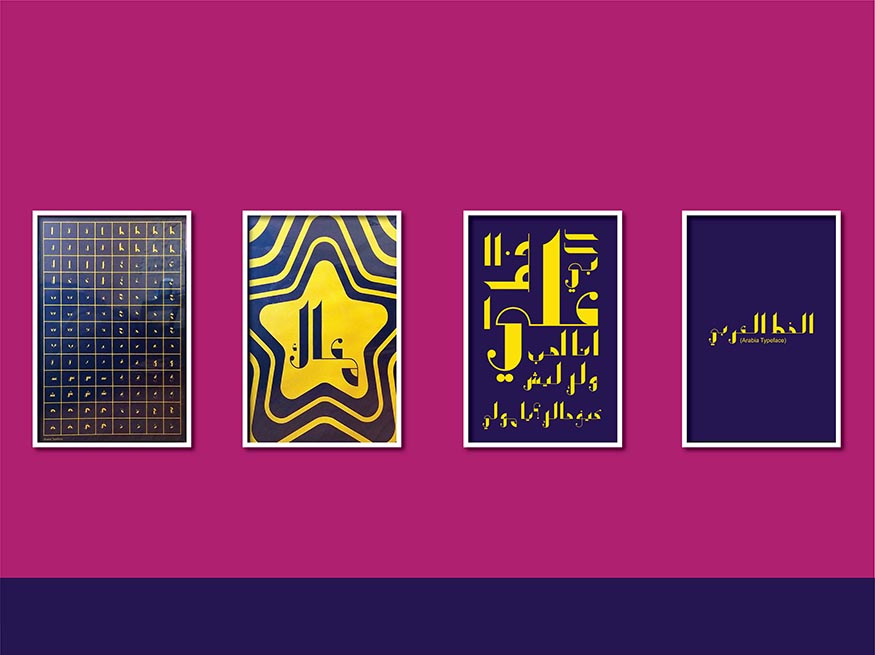
Designing an Arabic Typeface, Ali Muksed
Ali Muksed
Arabia, 2020
Font design
Image courtesy of the artist
Ali Muksed
Arabia, 2020
Font design
Image courtesy of the artist
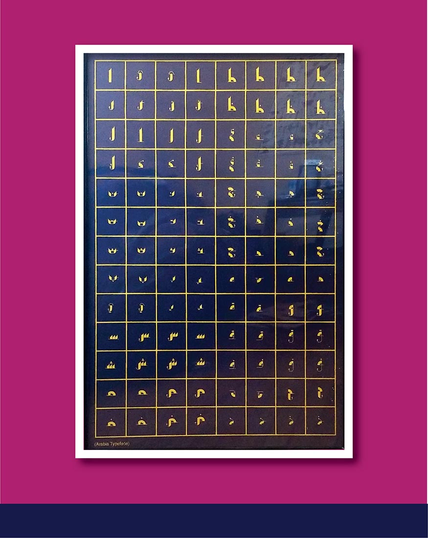
Ali Muksed
Arabia, 2020
Font design
Image courtesy of the artist
Ali Muksed
Arabia, 2020
Font design
Image courtesy of the artist
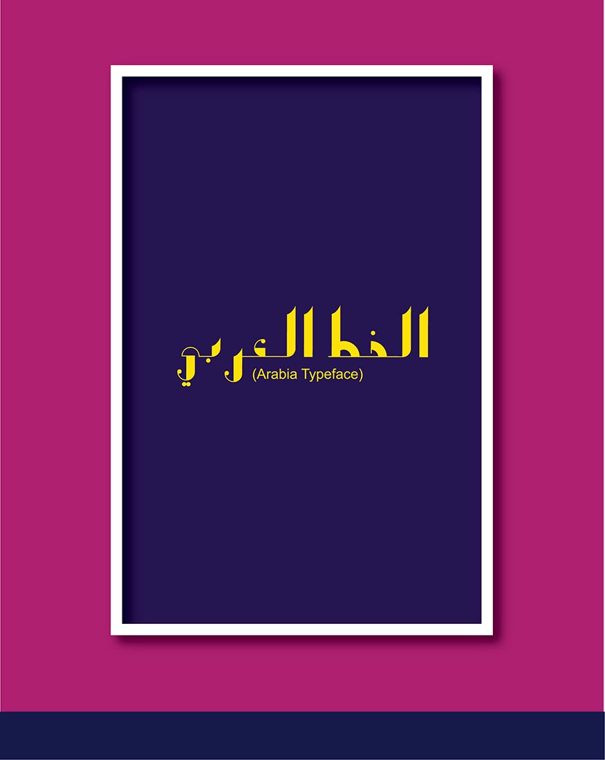
Ali Muksed
Arabia, 2020
Font design
Image courtesy of the artist
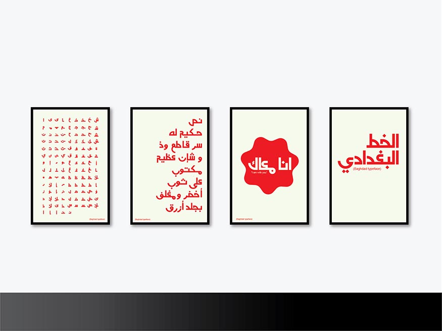
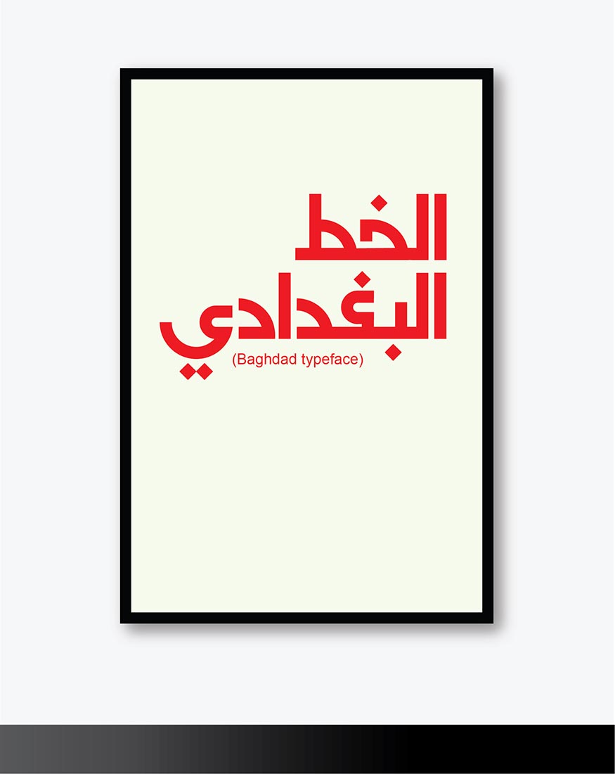
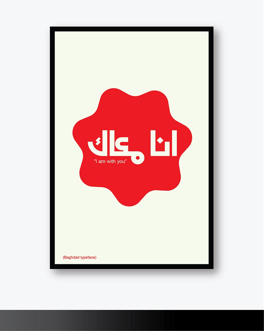
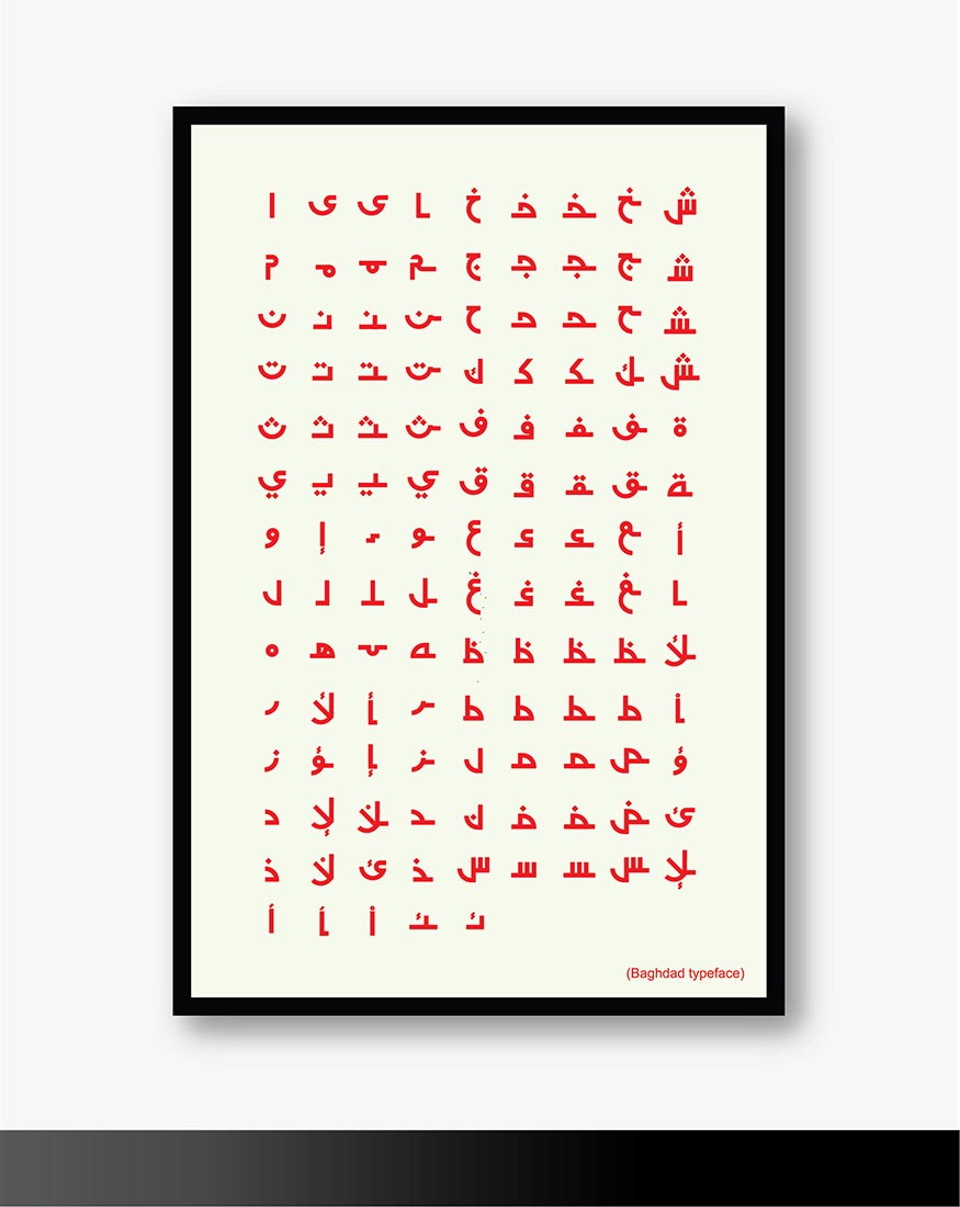
Ali Muksed
Baghdad, 2020
Font design
Image courtesy of the artist
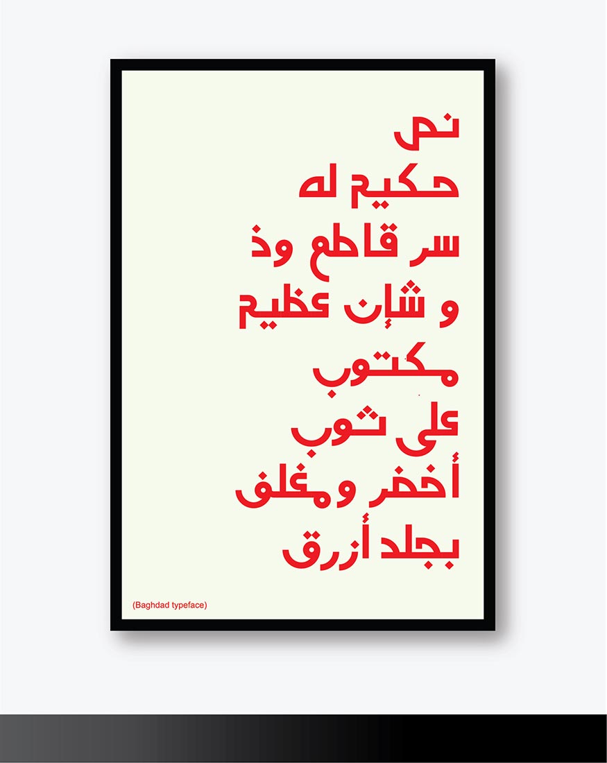
Ali Muksed
Baghdad, 2020
Font design
Image courtesy of the artist
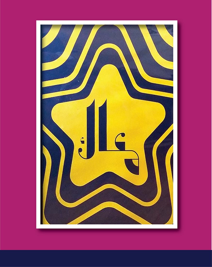
Ali Muksed
Baghdad, 2020
Font design
Image courtesy of the artist
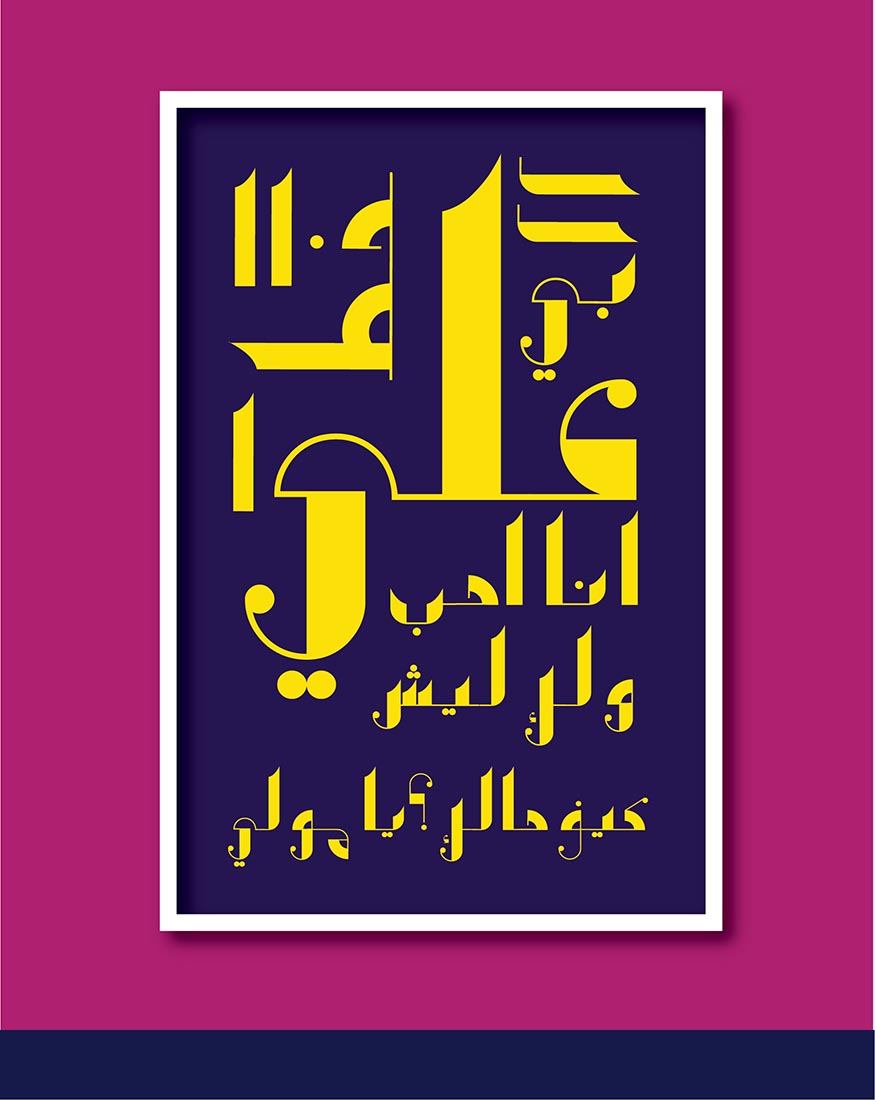
Ali Muksed
Baghdad, 2020
Font design
Image courtesy of the artist
Ali Muksed
Baghdad, 2020
Font design
Image courtesy of the artist
Ali Muksed
Experiments, 2020
Font design
Image courtesy of the artist
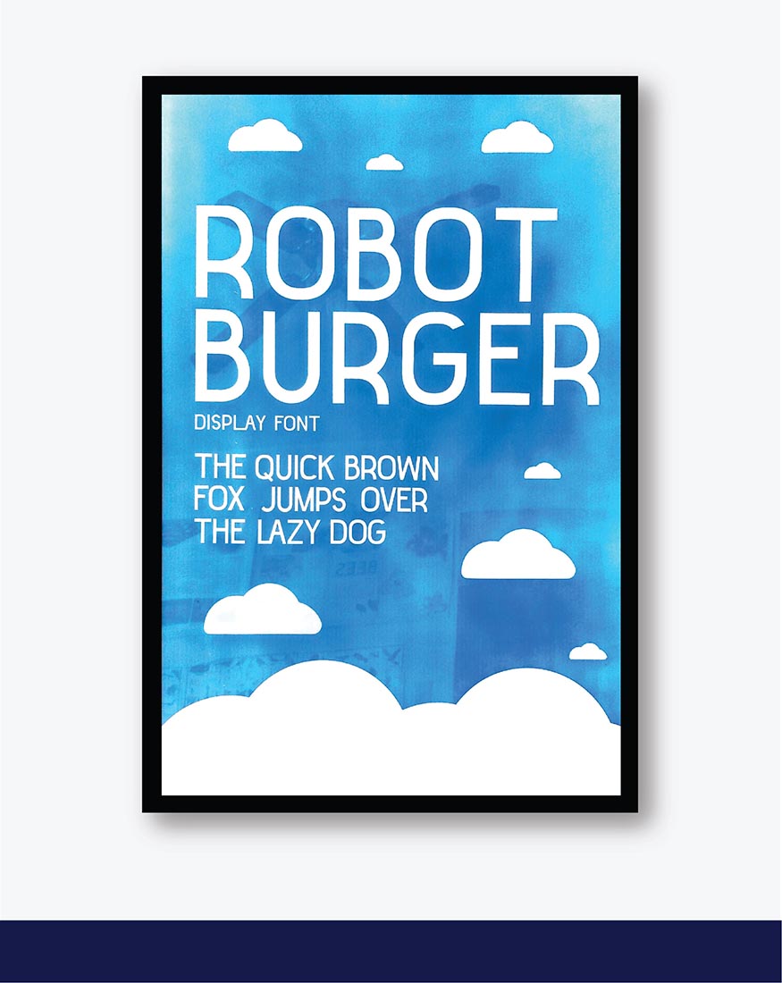
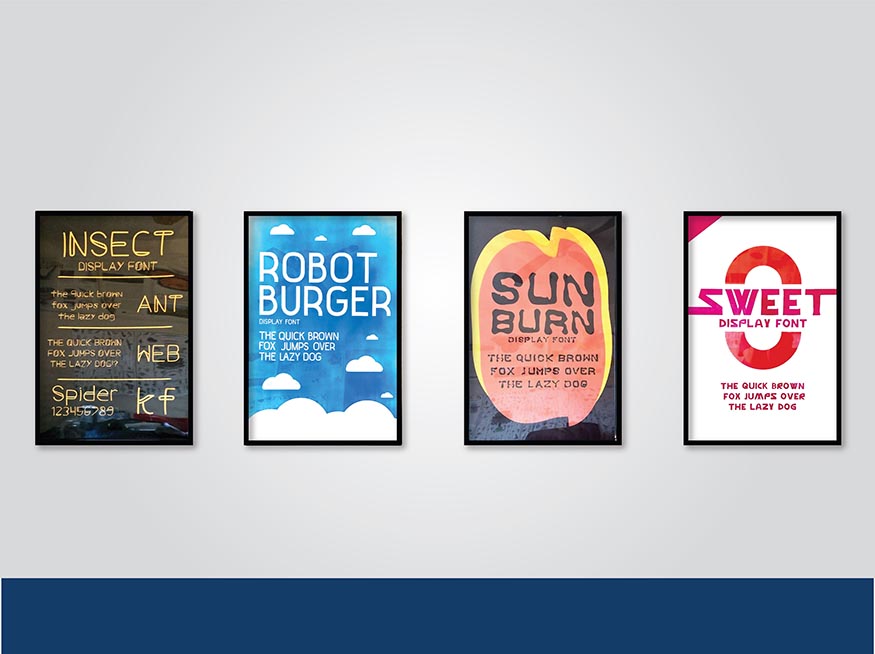
Ali Muksed
Robot Burger, 2020
Font design
Image courtesy of the artist
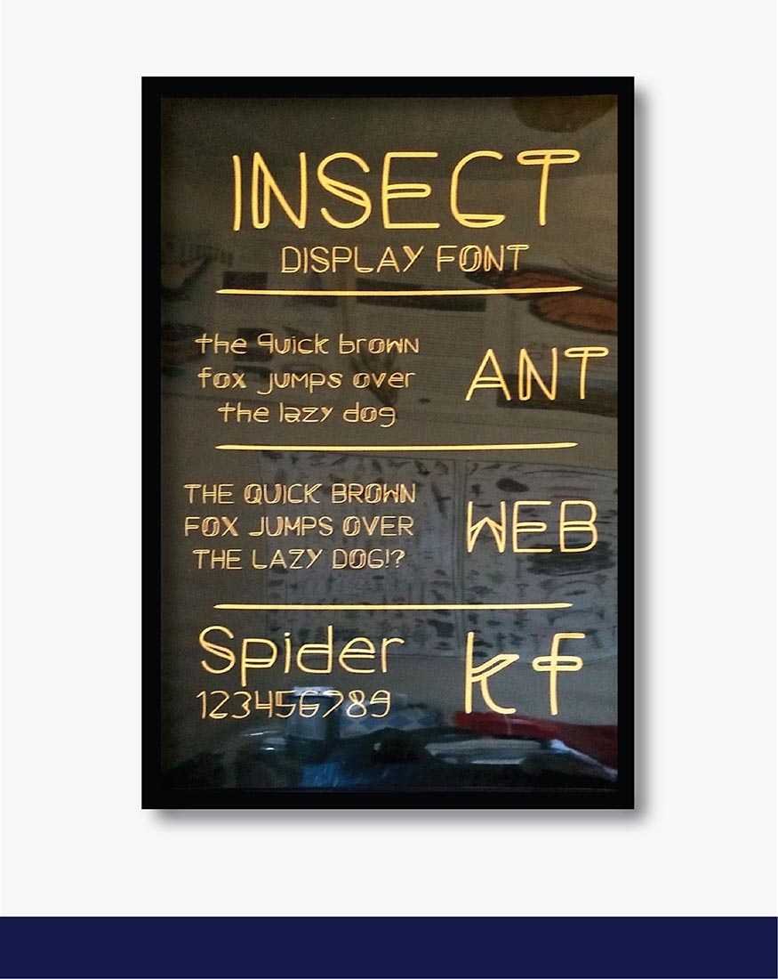
Ali Muksed
Insect, 2020
Font design
Image courtesy of the artist
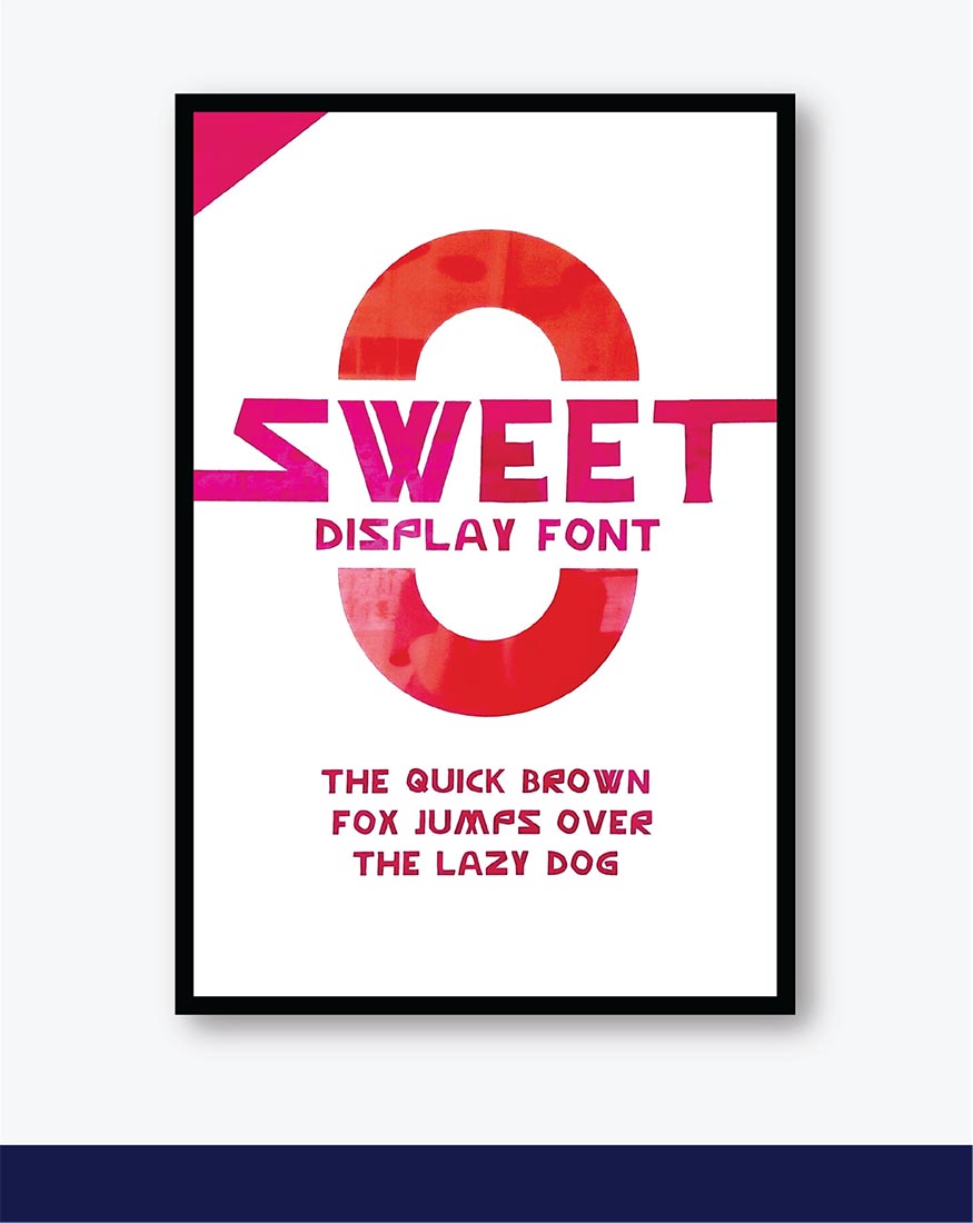
Ali Muksed
Sweet, 2020
Font design
Image courtesy of the artist
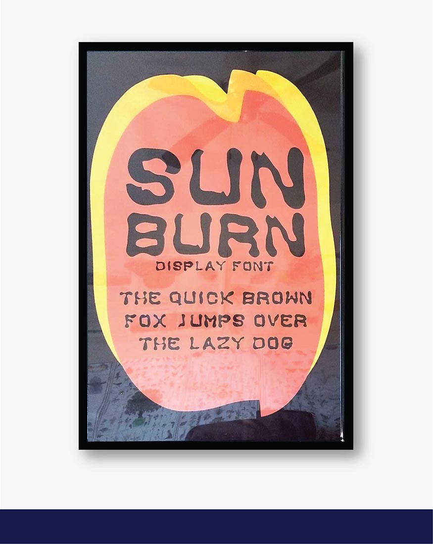
Ali Muksed
Sunburn, 2020
Font design
Image courtesy of the artist
Artist statement:
When I began to address the problem of underrepresentation in the Arabic typography, I did not grasp how fonts are made but I knew my liberal arts education at Augustana prepared me for solving such a problem. For the past six months, I studied Arabic typography with the intent of creating two display typefaces that represent the identity, diversity, and culture of the two Arabic speaking countries. This came about when I learned that there are about 108 Arabic font families on fonts.com compared to over 20,000 Latin font families. This is an issue of underrepresentation.
The most used Arabic typefaces are made by western typographers. As someone who grew up in an Arabic speaking country, I wanted to confront this issue by contributing to the Arabic typography. I started by studying and experimenting with the anatomy of Latin fonts. I developed four Latin display fonts as a result of hundreds of hours of experimentation. I am satisfied to present these fonts as part of my art show as they fulfill a significant role in my design process going forward.
When it came to designing the Arabic typefaces, it was a complex process as most font programs are geared for the development of Latin fonts. To make matters worse, there are little to no resources on how to develop Arabic typefaces from scratch. After hundreds of hours of research, I was capable of developing two Arabic typefaces that I named Baghdad and Arabia. The Baghdad typeface is based on the capital city of Iraq. This typeface is inspired by Kufic Calligraphy which originates from the city of Kufa in Iraq. It is an old Arabic script that is known by its geometric forms, it is the perfect reference to the city of Baghdad as it was formerly known for being the center of the Islamic world and art.
The second Arabic typeface, Arabia is based on the modern Arabian peninsula. It was inspired by fonts like Baskerville and Bodoni which are known for their thick and thin lines. I implemented western references to this typeface to represent how powerful the modern Arabian peninsula is influenced by the West. Countries like Qatar exude an urbane and luxurious atmosphere that I feel is inspired by cities such as Chicago and New York.
Some limitations that I faced when trying to solve the problem of underrepresentation in the Arabic typography were time constraints and the lack of resources. The process of creating Latin and Arabic typefaces presented a massive challenge for me as I never experimented with that field before. Based on professionals in the field, it requires a minimum of three to four months to develop a typeface. I designed six typefaces in six months; I was constantly learning and experimenting and I believe with more time, I can perfect the art. The second issue I wrestled with included not having the resources to create the Arabic Typefaces. I then began experimenting with Latin typefaces. The process of learning to write a scripting language from the right to the left of the page involved hundreds of hours of experimentation. Despite these limitations, I believe my initiative and determination to overcome such a problem has paid off. From taking on this challenge, I learned I enjoyed the process of researching and creating fonts. This project was outside of my comfort zone which explains why I learned a lot in the process. I learned that I am capable of solving issues that I am uncomfortable with. In the years to arrive, I hope to perfect the art of designing typefaces as well as expand my knowledge by developing this as a challenging pursuit.